
Everything posted by THRILLHO
-
As in Pollo Tropical Park ?
-
A window into why they didn’t make a big in person event for this. Saves them the embarrassment
-
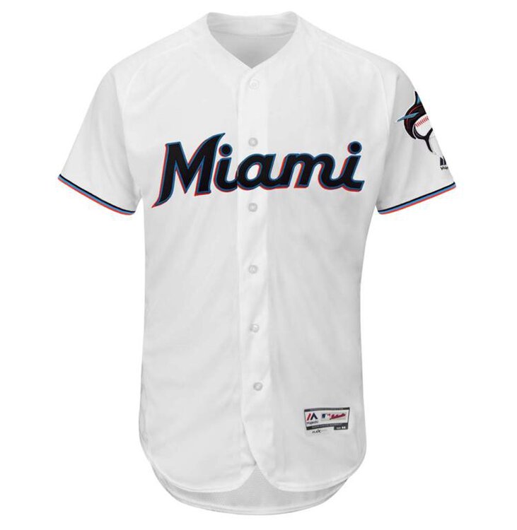
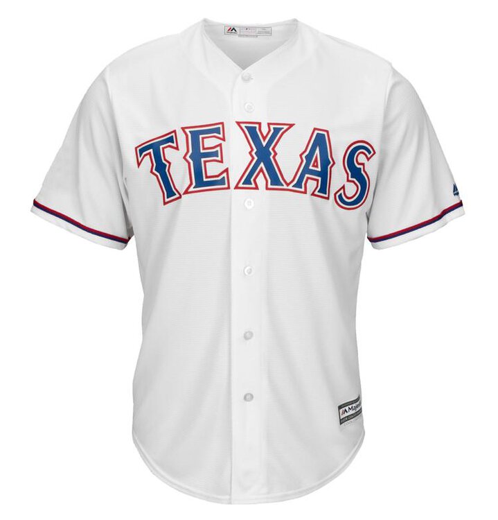
Another interesting comparison is Texas. They don’t use Rangers on the home shirt. They have a blank collar and use red and blue piping on the sleeve. Obvious difference is the black for Miami. Have a look. [ATTACH]2458._xfImport[/ATTACH][ATTACH]2457._xfImport[/ATTACH]
-
Authentic jerseys with players names going for $310. What planet do these people live on?
-
So they asked people about teal and decided to go against the response. I think they realize there is more than just merchandise sales. You want sales but then you want those hats and shirts to be worn out in public. People would buy teal caps but how many things can you wear teal with? These colors probably end up on the street with more frequency and that is what they want. They want their brand to be seen
-
Totally. Even better than online shop photos.
-
The closeups of our wordmark make it a lot better. I agree with you on the collar but I wonder if the three colors thing didn’t work there.
-
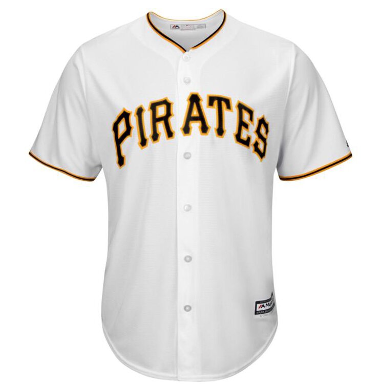
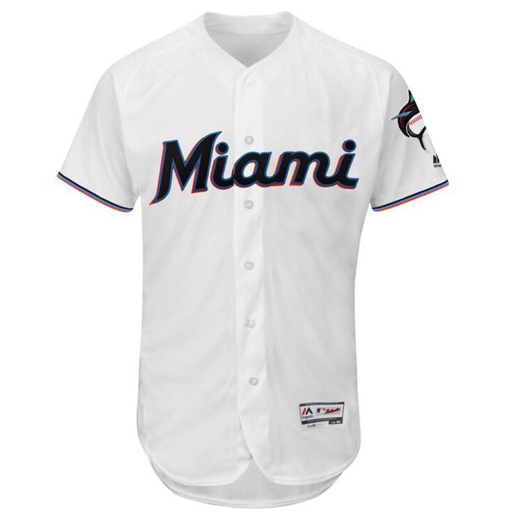
Here’s some other notable black font jerseys. I think the Orioles piping is distracting. Maybe they could have applied the same sleeve stripes to the collar like Pittsburgh and SF. Honestly our “plain” jersey isn’t far from those two. [ATTACH]2449._xfImport[/ATTACH][ATTACH]2450._xfImport[/ATTACH][ATTACH]2451._xfImport[/ATTACH][ATTACH]2452._xfImport[/ATTACH]


-
Fold it up and put them with your Piazza jersey
-
I’m not ordering anything online until I see it in person. I feel like this branding can be great but the execution relies so much on textures and other things that don’t translate unless you are holding it in your hand. Things I do like 1. The primary mark on the sleeve. It’s even better in the closeups on the jersey. The raised patch shows the whole side of the baseball. It’s an excellent primary mark. I think I’ll get a t shirt 2. The number font is solid. They blue and red really pop 3. I actually like the simple approach on the piping. I prefer a clean neckline on jerseys and the sleeve piping could loose some of the neon effect if it is too thick. Cons 1. The blue jersey is missing a sleeve patch. I think they would have been better off putting script Marlins on the blue and doing the chest patch on the black alt. Hopefully that blue jersey has a number on the other side for th field version. 2. The hat stitching is a letdown if my suspicion is correct wait and see 1. Stripes on the pants 2. Belt and stirrups. 3. Undershirts these things matter in the execution
-
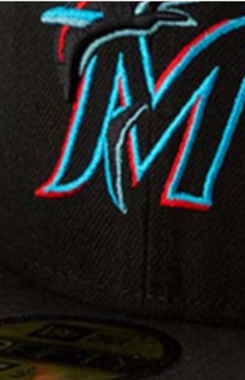
One thing I noticed about the hat is that there doesn’t appear to be any stitching inside the M on the black part for the authentic on field version. If you zoom in on the team store photo the wool pattern is clearly visible. There is stitching there for the 3930 and other replica hats but not 5950 [ATTACH]2447._xfImport[/ATTACH]
-
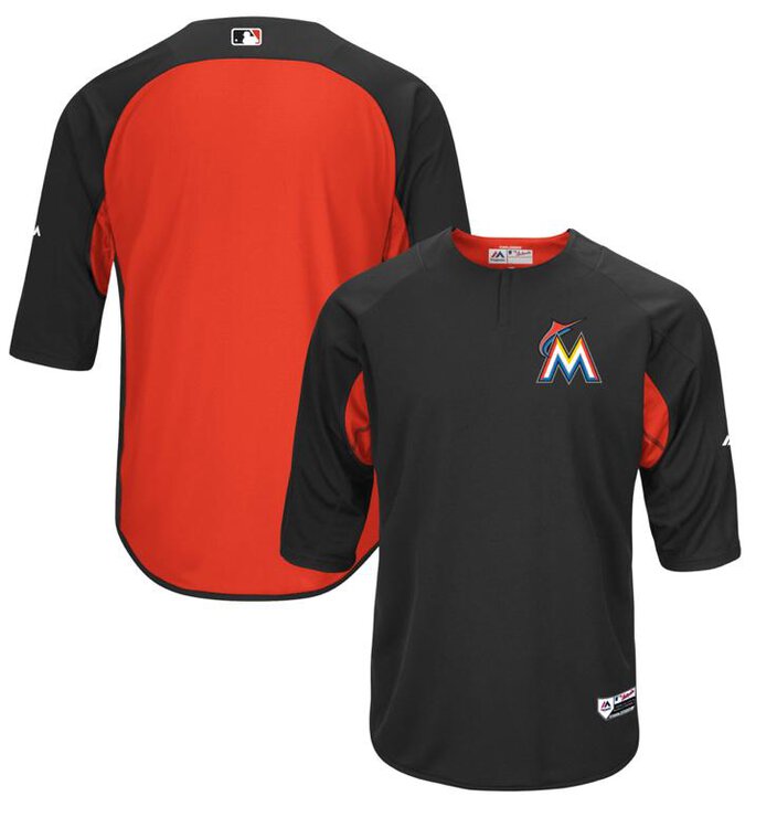
[ATTACH]2424._xfImport[/ATTACH] BP from last year
-
I think that blue jersey is a game alt not a BP. BP jerseys have silly armpits and stripes and shit. Last year everyone wore 3/4 length sleeves that were standard issue leaguewide. Those are normally released leading into spring training with ST hats and BP hats. Side note I think that Nationals release today was BS for this reason. The league announces ST hats all at once
-
I think the jerseys will look great. Those colors stand out. Just like the orange outline on Giants and the Yellow on Pirates our black Miami script will look awesome. I’m not worried about it
-
Better pic of the hat
-
The primary on the sleeve is nice. I prefer that to just putting the cap logo on the sleeve
-
I like the Home white. Im not big on piping down the buttons and I prefer a clean collar. The sleeve piping looks good. I see they didn’t have the fish on the M which makes the jersey less team specific and more city specific. I had done several versions of the white and the piping looked ok on it but I’m fine with a plain look. I guess I really want to like these
-
Agree. Throw a number on the front of that blue jersey and you’ve got an excellent road shirt
-
The whole focus on the brand rebrand has been local flavor. Miami. Etc. so having Miami on the shirt is consistent with that. I guess they feel Miami has a stronger appeal than Marlins. Miami is cool. Marlins are a club in need of fixing. Perhaps those things made them do this
-
There is no connection between the r and l in Marlins. That will take some getting used to. I prefer the way Miami looks in that script. For that reason I think I don’t mind Miami being on the Home white. Think they’d have been better off doing the hat logo on the black jersey with the number on the opposite side and using the marlins script on the blue jersey
-
That bottom right jersey looks grey. Traditional light grey for the road
-
So this logo launch gala....damn maybe they will trot out some uniforms at midnight. Miami am I right?
-
Logo looks super neon in this lighting
-
Looks like the panthers want in on the dark skyline action
-
Let’s go now