Everything posted by THRILLHO
-
We are pretty sure the red is the drop shadow which would place it below the number.
-
I wonder if it is structurally feasible to make this section of the roof (which does not move) glass. In theory you leave the support framework there and just replace the aluminum or whatever the metal is with glass. It would expand the openness. [ATTACH]2396._xfImport[/ATTACH]

-
They can make more fallen letters art on the sidewalk
-
Theory: Jeter wants the roof open more. He knows people hated the sun on the third base line so he creates this STO section in the RF corner so those people can get some shade.
-
Very nice. The standing room area on the right field line only indicates four rows of standing room. That leaves more existing seating than I thank many of us thought. Not good or bad. Just an observation
-
Most people won’t care about this but our number font was my chief complaint about the 12-17 uniforms. Going back to the standard block is a big plus to me. Most team specific numbering fonts fall short IMO. Cincinnati and Texas in particular bother me. Boston and Pittsburgh pull it off but other than that I can’t think of any that stand out
-
So now we are onto hats. No more jersey teasers. All blue road unis confirmed
-
You joke but the uniform snobs on creamers site are deliberating over how much blood orange or pink or red is involved. It’s hilarious.
-
I wonder how many former team president wander around radio and social media criticizing their former teams. I’m guessing it’s just this guy
-
-
It’s great oneupsmanship. Loria forced his version of art onto the facility. This rollout is giving artistic license to local artists to work with a pallete (albiet predetermined by ownership). But still it involves local artists which kicks ass
-
These colors are a big change from what we are accustomed to. I love them but some may not at first. So having these artists show how you can make these colors really awesome together is a great idea
-
You can see the baseball seam urine on the outline
-
No bro. Real deal. Just like that mural in Pinecrest
-
I’ll spare everyone the suspense [ATTACH]2373._xfImport[/ATTACH]

-
Another takeaway from today’s striptease: no pinstripes on the Home white jersey
-
I don’t think the intent here is to match team colors. Blue is a good neutral wall color. You used to see it a lot. Three Rivers; Fulton County; SkyDome to name a few. There’s a long list.
-
Or an all blue road ?
-
The fabric of the white looks more like a jersey material whereas the black fabric looks more like what you’d see from a letter or number
-
@B1az3 thank you. I love a good take down
-
My eye isn’t good for this sort of thing but it looks so obviously photoshopped. Of course someone could just drive to 12855 Pinecrest pkwy and verify
-
It’s been pointed out that the underside of the marlin is a dark grey. Perhaps that is an option for their road grey. Arizona uses a darker than normal shade
-
The inside corner angle of a 7 stitched on a white jersey. We will have white jerseys
-
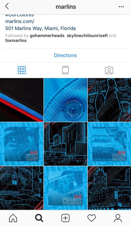
Nice little tile pattern on the Instagram page [ATTACH]2363._xfImport[/ATTACH]
-
I doubt it too. But I saw something about the cards possibly having them next year and it got me thinking.