
Everything posted by THRILLHO
-
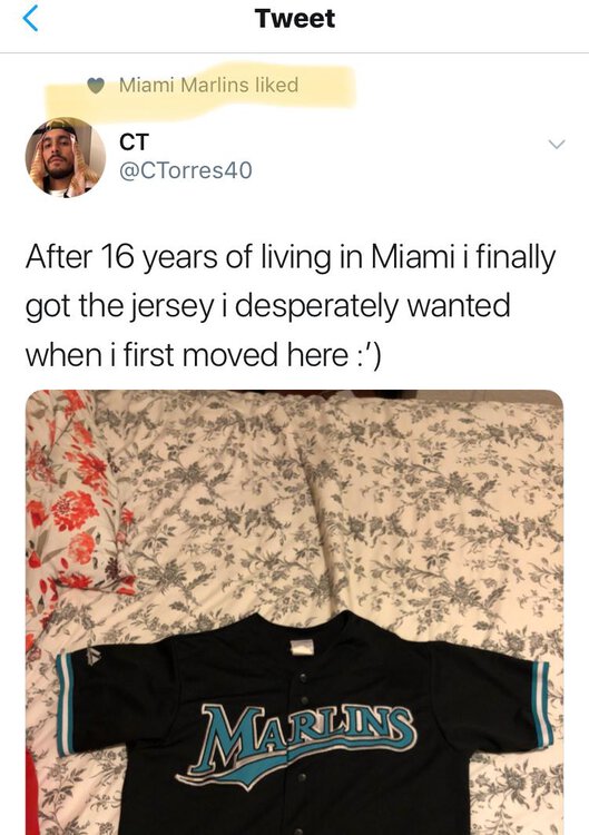
Marlins twitter account liked this. Let’s over analyze and over react and create concepts which will be picked up by children and promoted as leaks [ATTACH]2302._xfImport[/ATTACH]
-
Trip down memory lane someone mentioned the pitchers arm thing. That’s specifically the josh Johnson incident. Something like that would never happen these days http://www.espn.com/mlb/news/story?id=2598362
-
It seems like this concept took off as THE one based solely on the notion that it was the only one with a trademark on it.
-
Amazing a teenager would be the first to leak a real logo.
-
That’s hilarious. The Instagram account that posted it is the one that posted the original leak. Makes the whole leaked concept seem like bullshit. I don’t that the person behind that account posts here
-
I wasted too much time on this today. I feel gross
-
Silver bullet took it from creamers site. Some guy posted it there from reddit. But the sourced Reddit page doesn’t have it anymore
-
I’m not into sleeveless or pinstripes. Truthfully I don’t like piping either but with all the black this design could use the extra color im thinking today’s font leak isn’t legit. Just a hunch
-
I like it plain with the piping down along the buttons [ATTACH]2292._xfImport[/ATTACH]

-
Let’s find the next Chen This is laughable.
-
I agree. That would make the black script the clear choice. The fish doesn’t work in the other colors
-
Yet another option. Different piping. Includes Marlin in the M. Uses black font but the piping brings the blue down. Thought about making the front number red, but it was too Dodgery. I'm not inclined to incorporate pinstripes.[ATTACH]2291._xfImport[/ATTACH]

-
In messing around with these images the “blue” is really closer to the old teal than it is the more recent ocean blue.
-
What you’re saying is exactly why I thought the blue would work. But for some reason I think otherwise when it’s blue and not teal
-
I think I prefer the back script to the blue.
-
On the uniform it doesn't make a difference to me. It takes attractive options off the table in the retail world, but for on the field stuff it doesn't change anything significantly.
-
blue script .. again. I'm very amateur. Don't @ me.[ATTACH]2288._xfImport[/ATTACH]

-
[ATTACH]2286._xfImport[/ATTACH]

-
It looks really good when you introduce all the blue. Especially with the white circle. Like someone else said, a paneled cap would look good.
-
Damn you're right. Now I am obsessed with it. The leaked logo tells the whole story though. It seems they're going with that. The Cardinals script has a little tail on the a after the capital C but they don't connect.
-
very quick and very dirty [ATTACH]2284._xfImport[/ATTACH]

-
Small sample size and all that....I just showed these latest images to my wife who cares very little about baseball...let alone the minutia of the uniform scene....and her comment was "oh! Looks nice".
-
I'm inclined to agree but seeing it may change my mind. I was fiddling around with scripts of different styles (nothing worth posting) and colors and the blue didn't impress me as much as I was expecting them to
-
Also that M logo looks like it’s on a charcoal background
-
Another thing to consider is that a script marlins could be used on both Home and Road jerseys like the cardinals. That script when applied to a longer word like marlins and perhaps in blue would have a different impact