Everything posted by THRILLHO
-
I don’t know who these people are, but it is hilarious how the one guy says “this has never been done before”, when it has been done MANY times (even by this team) This thread is incomplete without Pitbull
-
That 2006 payroll figure is alarming. Check it out https://www.baseball-reference.com/teams/FLA/2006.shtml Two players made more than $1 million. Brian Moehler ($1.5) and Dontrelle ($4.25). Wes Helms came in at #3 w/ $800K, and Miguel Olivo #4 w/ $700K.
-
Yes. But there are many things that make a uniform. The rangers for example are really hard on my eyes because of all the trim on the font, the black drop shadow; and the font itself. Maybe I need my eyes checked?
-
HA! I know it’s odd. Just something I prefer on a jersey.
-
Yea. That was me. Nothing online since. I was hoping he could take an OF spot and Brinson could hang in NO for six weeks. Seems like a no go now
-
Does anybody know whatever happened with Rafael Ortega? As far as I know he never showed up.
-
If the short term plan was to improve upon the 2012-Present uniforms while they take their time on developing a new uniform in addition to the hat logo reduction they should have Removed the collar and sleeve piping. I cannot stand piping on jerseys. I know it is a personal preference, but the entire conversation about uniforms is personal preference. The orange piping around the collar looks like a little necklace and it is really lame. Clean that up. Make the number font on the jersey back a standard block number font with no drop shadow. Drop shadowing is bush league (Johnson Era Dolphins numbers). These are pretty minor changes. IF you make those two along with the hat logo and let it marinate for a year while you workshop ideas, the team might end up feeling like the current set is fine. I’m not a fine of the drop shadowing on the wordmarks either but you don’t want to rush into anything drastic.
-
Yes that was the exact image I saw. The article it was attached to said that those logos were the finalist that the team had to choose from. But the only one that has the look of a finished product is the one the team is actually using. It seems like the final product incorporates a lot of elements from the six “losers”. The artist and Loria seem to draw inspiration from the old Jai Alai logos.
-
I didn’t take it that way. i can’t remember where I saw it. It may have been this forum. There was a leaked set of logos that the marlins had to choose from during the 2012 rebrand. The one they chose was far and away the best
-
I don’t have any strong opinions on the cap logos. That’s why I ended up playing around with them today. I could be talked into a number of directions. I do love the original teal pinstriped Home white jersey with teal Marlin script. That jersey was great and I’d love to see it back. The sleeve patch was an excellent primary logo too. The cap logo...yea you’re probably right but like I said before ten more days of spring training so I played with logos
-
That one may not need the teal accent at the top of the M. What about this one?[ATTACH]1830._xfImport[/ATTACH]

-
Gotta say after looking at this for ten seconds I think the current hat logo with the teal colors is better than any of the combos or the old font turned into an M
-
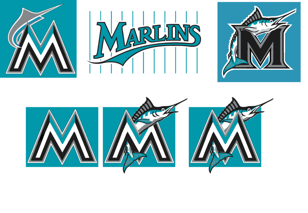
Or if you prefer the current M, but like the old fish logo, there are some options with combining those. of course none of this will happen. And none of this matters. Ten more days of spring training folks. [ATTACH]1826._xfImport[/ATTACH]
-
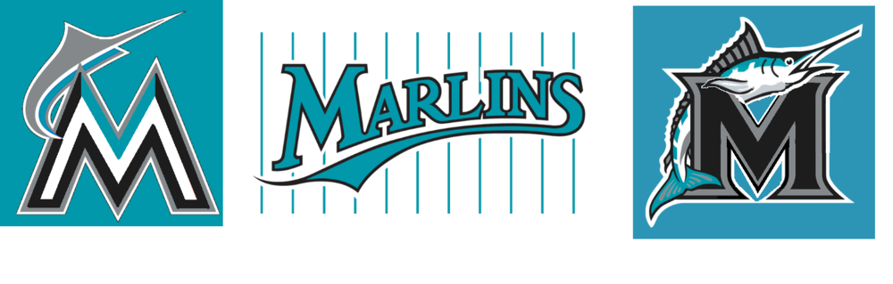
I'm a big fan of the original 93-02 wordmark (before they made it black w/teal and silver outlines. I'd like to see it back. I could go any direction on the hat. Most teams have very simple initials on their cap. With Cleveland moving to the block C full time next season that leaves only Baltimore and Toronto with a non City initial cap. Seattle has a compass on their S. Very simple though. I think taking the current M and making it teal would work. Also, using the old cap’s F font and making it an M would work too. Which do you guys think looks better (assuming you are pro teal)? I know we had a BP cap with the script M at one point. I preferred the block F font. It isn’t out of the ordinary to have different fonts on the cap and the jersey. Lots of teams do this [ATTACH]1824._xfImport[/ATTACH]
-
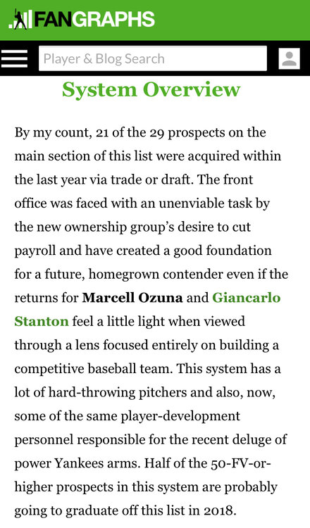
https://www.fangraphs.com/blogs/top-29-prospects-miami-marlins/ this summary tells you everything [ATTACH]1823._xfImport[/ATTACH]
-
I’m not a big basketball guy so could you explain this one for me.
-
This! [ATTACH]1816._xfImport[/ATTACH] but not this [ATTACH]1817._xfImport[/ATTACH]


-
joe having “some fun” in the responses
-
Precisely how Dan Uggla got a shot. Incidentally that 06 team exceeded expectations by a lot so hey ..2018 who knows
-
Last i heard he was delayed getting here due to visa problems
-
Please God no
-
I agree with you. I mentioned that because it seems some people on social media took issue with the size of it. The team chose something and used the same template for both men, which is totally fine and normal.
-
FWIW the plaque honoring Felo on the other side of the wall is identical in size. It has a microphone instead of the jersey number.
-
They'll do the right thing. Right? Right!!!???? I mean the Fernandez thing was all Loria being meddling. Sherman knows he doesn't know crap about baseball. I think Jeter gets it and he leans on the staff for execution and what not. Assuming the staff know the rules (low bar) this shouldn't be hard. I'm not worried yet.
-
No need Barry reads this forum