December 17, 200421 yr When was that picture of the field taken? Opening Day 2004. If you look closely, you'll see one of the folks who parachuted into the stadium bringing the Championship flag. Thanks for all the compliments, folks. I'm honored and grateful to Admin for the opportunity to leave my mark on MB.com. I must say, logo or no logo, this site is already great thanks to Admin & Crew, and the greatest baseball fans in the world. You deserve the best. 637346[/snapback] Cool! I didn't think anyone would be able to give me the answer to my question-lol. And nice job with the banner! :thumbup
December 17, 200421 yr will it be used on the main page, too? 637381[/snapback] I think so...I mean why not?
December 17, 200421 yr Author badass logo. will it be used on the main page, too? 637381[/snapback] Yes, of course. I am just going to rework the buttons a little first.
December 17, 200421 yr Author I like the buttons being there too under the banner 637484[/snapback] me too 637489[/snapback] I had hoped people would.
December 17, 200421 yr Dood, Beetle, you are great! That is so f***ing awesome. Great job man! And Admin, keep up the good work as usual!
December 18, 200421 yr Can't wait to see if the Miami Heat Central gets a Beetle makeover! Beetle is one of the best, looks like a professional logo! WOW!
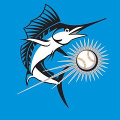
December 18, 200421 yr I LOVE that logo. One suggestion: I see the teal on the boards has changed. IMO it looks to greenish. I liked the other teal we had before more than this one. I'd like a teal closer to this one on the Marlins official site.
December 18, 200421 yr Awesome look. Id change the front page font to something prettier though. Just my .02
December 18, 200421 yr Its good :thumbup , but next time I think you should incorporate the mermaids. :mischief The male audience would love it!
December 18, 200421 yr It would be nice to have either two banners designed by Beetle if possible or the two championship logos at the top of the site.
December 18, 200421 yr Author It would be nice to have either two banners designed by Beetle if possible or the two championship logos at the top of the site. 637800[/snapback] He made a bunch of banners. I'm going to have them around the site. Team pages will have a certain one. Stadium pages another, etc.
December 18, 200421 yr It looks great but the .com is a little hard to read. I'd prefer it closer to the middle of the logo, instead of under or wrapped close to the L of baseball. Just my $ .02 worth....
December 18, 200421 yr Thanks, everyone. Admin, the buttons are looking good. Nice work. 637875[/snapback] Agreed. Buttons match well too. Great upgrade on the site.
December 18, 200421 yr Great work guys! I really like it the old logo was way to dull, this is a very sharp logo, most of allli like the buttons, and i see the home page got fixed up, keep up the good work. I like the team icons too.
December 18, 200421 yr Admin, why dont you make the highlight of the menu of the buttons teal instead of blue?
December 18, 200421 yr Author Admin, why dont you make the highlight of the menu of the buttons teal instead of blue? 637975[/snapback] It is teal.
Join the conversation
You can post now and register later. If you have an account, sign in now to post with your account.
Note: Your post will require moderator approval before it will be visible.