SilverBullet Posted February 12, 2018 Author Share Posted February 12, 2018 also SP/BP jerseys used to look completely different from their game jersey, now they just used one of the jersey from their set and that's it. lame Yes this is a huge pet peeve of mine. I hate this trend though a couple of teams still do have exclusive ST/BP designs. Quote Link to comment Share on other sites More sharing options...
SilverBullet Posted February 12, 2018 Author Share Posted February 12, 2018 Also, the prominence of white on the road gray jersey wordmark is a huge eyesore. Personal opinion only but I love the white lettering on the gray jersey. It's a unique quirk that makes the jersey pop more. I didn't like it at first either though but I've learned to love it. It's arguably my favorite Marlins jersey because of that feature alone. Quote Link to comment Share on other sites More sharing options...
SilverBullet Posted February 12, 2018 Author Share Posted February 12, 2018 Subjective of course but it has the exact opposite effect on me because there is not enough contrast between the two tones. It just comes off as bland and a little straining on the eye. People always talk about the Marlins having "rainbow" colors, but in the case of most of the jerseys (excluding the orange alternates), I don't think they use enough color. The color accents on the wordmarks don't really do enough heavy lifting given how blocky the lettering is. So I take it you'd prefer the lettering be a different color than white but not black? Because I think that could work. Most would expect that jersey to have black lettering but that would keep it as bland as you already think it is. Coloring it that light blue or red orange might be really interesting. As for the rainbow thing, that's such a huge misconception. The logo is colorful but their uniforms are really just black white and orange. Quote Link to comment Share on other sites More sharing options...
SilverBullet Posted February 12, 2018 Author Share Posted February 12, 2018 It is weird because it is a wasted potentially easy extra money stream. Exactly. It's amazing how popular these jerseys were/are and one day it hit me... the Marlins never ONCE wore an all teal jersey for a regular season game. These were only BP/ST jerseys. [ATTACH]1755._xfImport[/ATTACH][ATTACH]1754._xfImport[/ATTACH] Quote Link to comment Share on other sites More sharing options...
Admin Posted February 12, 2018 Share Posted February 12, 2018 Yeah I love that teal jersey and it was never worn in a regular season game (should've been). The one with the black writing I liked. Didn't like the silver one as much. Quote Link to comment Share on other sites More sharing options...
Entendu Posted February 13, 2018 Share Posted February 13, 2018 I really like the home whites we have. Not a fan of the blacks though Quote Link to comment Share on other sites More sharing options...
Admin Posted February 13, 2018 Share Posted February 13, 2018 I really like the home whites we have. Not a fan of the blacks though I think part of the problem is we tend to overuse the black jerseys. Quote Link to comment Share on other sites More sharing options...
SilverBullet Posted February 13, 2018 Author Share Posted February 13, 2018 I think part of the problem is we tend to overuse the black jerseys. They've gotten a lot better with that the last 2 seasons. A few years back the gray jersey was literally never used and the black was used for every road game. Now the black is a road alternate and is worn at home only on Saturday night games. Quote Link to comment Share on other sites More sharing options...
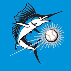
THRILLHO Posted February 13, 2018 Share Posted February 13, 2018 Great, uniform talk…here’s my two cents. 93-11: The teal hat is wonderful but it is a big ask to have something that bold as the everyday hat. I’m not sure if the team shifted to a black hat for all games because of players or because of marketing/merchandise to the public but nowadays the latter shouldn’t matter as much since there are so many merchandise options for fans to buy. You could put any logo on any color hat and sell it (just look at the offerings now on the Art Deco M online). I’m not a fan of vested jerseys. My absolute favorite from this era was the pre-03 Marlins script in teal on the sleeved home shirt with teal pin stripes. I do not like pin stripes but they worked on that Marlins jersey. I was really disappointed when they went away from the teal Marlins script w/teal pin stripes to a black Marlins script with black pin stripes in 2003. Massive downgrade. Also, my all time favorite Marlins mark is the leaping fish over the baseball that appeared on the sleeve in the early days. I’d love a return of that logo. 12-Present: When I first saw these my only complaint was that the hat logo was a little too big. I’m over that now. Now I think they could do with a standard font for the jersey numbers and it would be fine. The black jersey doesn’t work for me at all. Looks like it should be for batting practice only. By and large I like both versions of the Marlin uniform. I think there is an opportunity to use both and it wouldn’t be a complete departure from historical norms of the league. If the team does go for a rebrand I’d like to see them use the original teal Marlins script with teal pinstripes at home w/the old script M+leaping Marlin on a black hat. On the road use the current home black MIAMI wordmark with teal accents in place of the multicolors and the current Art Deco M with teal accents. I think this works for several reasons: You can sell merchandise from both eras. Fans of both designs get something. There are precedents for mismatching fonts. Doing this isn’t groundbreaking. Mismatched home/away jersey fonts White Sox Tigers Indians Yankees Cubs Mets Many more from the past (pre 98 Cincinnati, 80s Giants, 93 Marlins come to mind) Mismatched Cap font and Jersey Font Marlins Pre 2012 Mets Home Dodgers Twins Tigers White Sox Road Someone mentioned that black word marks aren’t the greatest. I tend to agree. The only other team that uses one currently is the Pirates. They’re really left with no other choice but yellow and given the contrast issues black is probably most appropriate for them. Perhaps using the art deco MIAMI script on the road in teal with black accents would be an option similar to how the team used the block FLORIDA on the original road uniforms. Having a dedicated home and road cap isn’t ground breaking either. Most of these only differ by way of having a different color bill, or like the Cardinals used to do a red and a navy hat with the same logo. But the Diamondbacks used to have completely different hat logos too. The desert A and the snake shaped into a D. It would look odd to have the old leaping Marlin hat logo matched to the current MIAMI font so, in that case using two hat logos would seem most appropriate. If they left everything as is I’d be perfectly fine with it. If they went straight back to the old branding I’d much prefer the pre 03 stuff to the 03-11 stuff. Quote Link to comment Share on other sites More sharing options...
SilverBullet Posted February 14, 2018 Author Share Posted February 14, 2018 One ST tweak from the regular season orange jersey I think that wasn't mentioned is the number and name on the back are white. Oh yeah, I didn't mention that as that was the same as last year, for spring training. So it's basically the orange jersey with a spring training patch and the white names and numbers (which look horrible by the way, they look like they forgot to color them in). Quote Link to comment Share on other sites More sharing options...
el_gmac Posted February 14, 2018 Share Posted February 14, 2018 Oh yeah, I didn't mention that as that was the same as last year, for spring training. So it's basically the orange jersey with a spring training patch and the white names and numbers (which look horrible by the way, they look like they forgot to color them in). the problem with so much coloway in the front and hat , seeing a solid color on the back makes it odd. But I like solid color on uniforms Quote Link to comment Share on other sites More sharing options...
SilverBullet Posted February 14, 2018 Author Share Posted February 14, 2018 the problem with so much coloway in the front and hat , seeing a solid color on the back makes it odd. But I like solid color on uniforms Well let me clarify because yes solid color can look nice. The problem is when a team doesn't have solid colors and then they show up to spring with these all white numbers and names and it just looks bad. Especially in white. Quote Link to comment Share on other sites More sharing options...


Recommended Posts
Join the conversation
You can post now and register later. If you have an account, sign in now to post with your account.
Note: Your post will require moderator approval before it will be visible.