December 27, 20223 yr Oh god the orange is hideous now lmao. I'd have secretly changed the hex code just to make it more appealing. Looks like a dull yellowish pumpkin spice color instead of the nice saturated orange of the caps back then. Oh well, just venting on the shade.
December 27, 20223 yr Oh damn the red is much darker too. Crazy how different colors can look in various settings. Also when you look at them side by side the two blues are noticeably different but still close enough that they'd be hard to tell apart without direct comparison.
December 27, 20223 yr 7 minutes ago, SilverBullet said: Oh god the orange is hideous now lmao. I'd have secretly changed the hex code just to make it more appealing. Looks like a dull yellowish pumpkin spice color instead of the nice saturated orange of the caps back then. Oh well, just venting on the shade.
December 28, 20223 yr 19 minutes ago, SonOfJack said: I'd just crop yellow out of that and make believe it never happened To be fair it's one of those like the Yankees red where it's just a part of the logo colors but literally is never used anywhere else.
December 28, 20223 yr 1 hour ago, SilverBullet said: To be fair it's one of those like the Yankees red where it's just a part of the logo colors but literally is never used anywhere else. Can't the same be said for orange in the original logo also?
December 28, 20223 yr 1 hour ago, Das Texan said: Can't the same be said for orange in the original logo also? Yes. And the "slate gray" in the current logo. And the yellow in the Cardinals bat even though I've seen a few STL players start using that in their accessories now.
December 28, 20223 yr 9 minutes ago, SilverBullet said: Yes. And the "slate gray" in the current logo. And the yellow in the Cardinals bat even though I've seen a few STL players start using that in their accessories now. I think we got rid of those guys for not adhering to the 'Cardinal Way'.
December 28, 20223 yr 13 hours ago, SilverBullet said: Oh damn the red is much darker too. Crazy how different colors can look in various settings. Also when you look at them side by side the two blues are noticeably different but still close enough that they'd be hard to tell apart without direct comparison. Yeah, the red got changed yesterday I think. 13 hours ago, SilverBullet said: Love this chart for anyone who hasn't seen it... I still find it funny that the only reason orange was used in anything 93-11 was because of the orange at the ballpark. It otherwise had nothing to do with the brand, logos, etc. At least the yellow was on the logo.
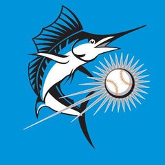
December 28, 20223 yr 4 hours ago, rmc523 said: Yeah, the red got changed yesterday I think. I still find it funny that the only reason orange was used in anything 93-11 was because of the orange at the ballpark. It otherwise had nothing to do with the brand, logos, etc. At least the yellow was on the logo. The orange was in the original logo. The seams of the baseball behind the fish are orange. Yes this was a shock to me as until recently I always thought they were red. I think it's a mind trick as our mind always assumes red laces on a baseball. With that said I don't remember any use of orange anywhere other than those laces from 93-01. But when Loria came in 02 suddenly orange was added in every promotional or marketing thing, and on special occasion logos and things like that. I have a shitload of giveaways from that time (when they were actually usable quality items) such as a duffle bag and towels and a cowbell and they're basically all orange and black with the teal and black logos on top of the orange. And someone on Twitter recently posted some of the schedule magnets from around 07-10 and again there's a shitload of orange.
December 28, 20223 yr 1 minute ago, SilverBullet said: The orange was in the original logo. The seams of the baseball behind the fish are orange. Yes this was a shock to me as until recently I always thought they were red. I think it's a mind trick as our mind always assumes red laces on a baseball. With that said I don't remember any use of orange anywhere other than those laces from 93-01. But when Loria came in 02 suddenly orange was added in every promotional or marketing thing, and on special occasion logos and things like that. I have a shitload of giveaways from that time (when they were actually usable quality items) such as a duffle bag and towels and a cowbell and they're basically all orange and black with the teal and black logos on top of the orange. And someone on Twitter recently posted some of the schedule magnets from around 07-10 and again there's a shitload of orange. I always thought they were red too. And I also figured orange got used because of the excessive amount of it at the old stadium. But I do remember reading that Loria loved orange (which makes sense, given he made it a main color in the rebrand).
December 28, 20223 yr Though I don't hate the current colors, I still dislike that we went away from what was perhaps the most unique color in the league - the teal (aside from perhaps the Rockies' purple). And now we have black/red/blue and basically ignore our most unique color of the new set too...
December 28, 20223 yr 10 minutes ago, Michael said: This thread is getting a lot more traction than I anticipated.





Join the conversation
You can post now and register later. If you have an account, sign in now to post with your account.
Note: Your post will require moderator approval before it will be visible.