February 21, 20179 yr Author We just make the right decision to keep him,really a funny guy. I want his shades, don't you?
February 21, 20179 yr Author Yea,but I think that's not cheap. I have major blog money it's no problem
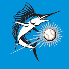
February 21, 20179 yr His shades are nice but he had those last season, several players did. I'm more concerned why the fish on his jersey logo is jumping the wrong direction.
February 21, 20179 yr His shades are nice but he had those last season, several players did. I'm more concerned why the fish on his jersey logo is jumping the wrong direction. I think it's a mirror.
February 21, 20179 yr His shades are nice but he had those last season, several players did. I'm more concerned why the fish on his jersey logo is jumping the wrong direction. And why logo has become so many shades of orange?
February 21, 20179 yr Author His shades are nice but he had those last season, several players did. I'm more concerned why the fish on his jersey logo is jumping the wrong direction. I never noticed his shades last year after his took his shirt off. Sorry, not sorry.
February 21, 20179 yr And why logo has become so many shades of orange? That's the spring training logo. It's nice but mismatched like hell when paired with the regular logo and that bugs me. But so many teams have mismatched logos in spring training because new caps and or jerseys get made and they never actually worry about having a cohesive look.
February 21, 20179 yr Author That's the spring training logo. Do they also wear it for BP during the season? I forget
February 21, 20179 yr Author Speaking of logos: Why is chief Wahoo bad. But whatever the braves have is ok? The tomahawk?
February 21, 20179 yr Author No the brave logo Which one? http://www.sportslogos.net/logos/list_by_team/51/Atlanta_Braves/
February 21, 20179 yr No the brave logo But the tomahawk too Which Brave logo? If it's the screaming Indian face, they no longer use that logo so that's why they don't get heat for it. The last time they attempted to use that logo it was scrapped before it hit the field. I can't think of any other Braves logo that is anywhere as close to being as offensive as people say Wahoo is.
February 22, 20179 yr I never noticed his shades last year after his took his shirt off. Sorry, not sorry. I know you like that,I know.
February 22, 20179 yr I never noticed his shades last year after his took his shirt off. Sorry, not sorry. This is for you Admin, enjoy...
February 22, 20179 yr Speaking of logos: Why is chief Wahoo bad. But whatever the braves have is ok? Chief Noc-A-Homa is no longer used by the Braves. They replace him with a bad fake Mr.Mets mascot. They tried to used it on 2013 for their BP caps but got shut down intermediately by MLB . but some made it to retail and was replaced by this
February 23, 20179 yr Chief Noc-A-Homa is still used by the Braves at times. I thought the logo had been banned but at a few games last year I noticed this version showed up on promo bumps on the jumbotron at Turner. They also still sell shirts with that logo on it.
February 23, 20179 yr Chief Noc-A-Homa is still used by the Braves at times. I thought the logo had been banned but at a few games last year I noticed this version showed up on promo bumps on the jumbotron at Turner. They also still sell shirts with that logo on it. Yeah but it's not on any authentic in game player worn gear.
February 23, 20179 yr ...but it's still used by the Braves in authentic marketing material during official games. I don't see what the difference is.

Join the conversation
You can post now and register later. If you have an account, sign in now to post with your account.
Note: Your post will require moderator approval before it will be visible.