Everything posted by QbanCastillo
-
Lewis Brinson[ATTACH]2726._xfImport[/ATTACH] JT (before the trade announcement) [ATTACH]2727._xfImport[/ATTACH]
-
These were pretty cool too. Made me feel more part of it since I couldn't be there.
-
That blue bill hat is so sexy. Is it sold anywhere online?
-
-
Personally, I think all the other GMs are holding out thinking, and hoping, that the Marlins will cave in as its usually been in the past. They still think things are the way they were when Loria was pulling all the strings and not letting Hill make the trades - desperate and in a hurry to let go of good players. Teams want Realmuto? Well, give up your great prospects!! That's how its done. That's how its going to be. The Marlins org knows this too well as there is a lot riding on this trade. If they fail they know us fans will tear them a new one. All the baseball writers and people in the media keep saying the Marlins are asking too much but its all posturing. It seems as if they're trying to pressure the Marlins to lower their ask. I could be reading too much into this but, come on, when has the baseball media been friendly to the Marlins? They're not used to the org being in a highly leveraged situation and not backing down from what they want. Teams better get realistic because they're not getting JT for peanuts.
-
That's what I want the cap logo to be! It's so clean and easy to distinguish. With time it can be iconic too. I really hope they see that this cap is going to be super popular and use an on-field version.
-
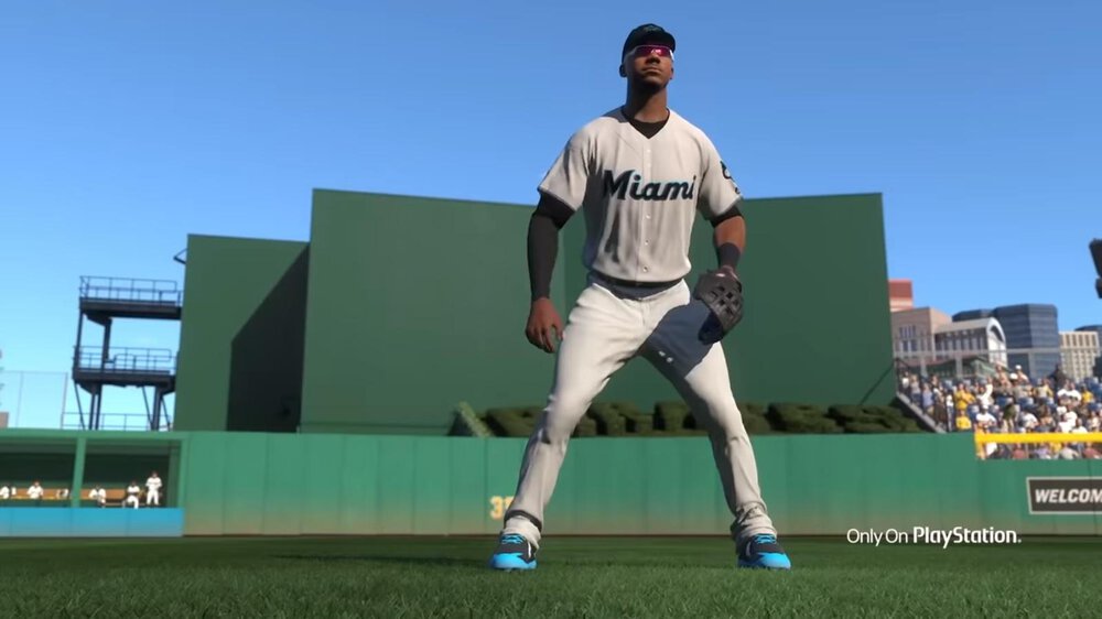
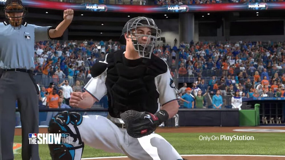
Just noticed that if players don't wear long sleeves underneath the jerseys then the sleeve piping really becomes invisible.
-
In the aspect of overall "respectability" in Baseball, these new uniforms and logos are a move in the right direction.
-
Well, I saw the pink "sunrise" color last night. I'm guessing that was a glitch while @SilverBullet was working on it last night then?
-
I liked the black and the light blue options. Not a fan of the Pink/Salmon option.
-
This is all the Primary Logo SHOULD have been...heck, this could have been the Cap Logo too! [ATTACH]2444._xfImport[/ATTACH]

-
Idk why the quote is not properly showing up above but I never said this lol... Anyway... the jerseys aren't that bad but they certainly need a bit more pop of color. The piping seems too small. I guess I would have to see them in-person or see them in more instances on players but for now totally too much black for the Black Alt jersey and the Home White looks boring. The Blue Alt with the Black Cap looks great though! I also agree with whoever said that the up-close shots of the jerseys look really nice so it may be better in person. The Primary Logo patch is also fantastic. [ATTACH]2443._xfImport[/ATTACH]

-
Wth? I never said this...
-
Honestly, I think the Miami script looks a lot better than the Marlins scripts so I prefer that. More compact, less letters. Solid.
-
Who was the one that drew up those mock jersey ideas? Was it here on the SportsLogo site? I think I remember him/her saying it was a guess but looks like they really nailed the blue jersey with the Cap Logo on the side correctly.
-
I wouldn't mind at all if we ditched the grey jerseys.
-
Love the Primary Logo sleeve patch on the white. It's perfect without the Miami script and works with the baseball stitching.
-
Yeah, no way he would have won it this season playing for us.
-
Maybe they do a live stream on Instagram. Perhaps from the Spring Training facility? How far away is that? I can't think of anywhere else since I don't live in Miami.
-
Maybe they do a live stream on Instagram. Perhaps from the Spring Training facility? How far away is that? I can't think of anywhere else since I don't live in Miami.
-
They have to try and save money, you know! Every penny counts!
-
They have to try and save money, you know! Every penny counts!
-
Dammit. This basically confirms the new primary logo. I really wanted more of a traditional baseball logo somewhat like our original one with the Marlin and the baseball, or at least a nod to that. Don't like how liberal this one looks...with the word "Miami" right below the Marlin. [ATTACH]2376._xfImport[/ATTACH] [ATTACH]2377._xfImport[/ATTACH]

-
This shirt [ATTACH]2364._xfImport[/ATTACH]

-
I just thought of something. What if all these mural art/paintings was a condition, or a deal that Jeter and Co. struck, to be able to move the HR sculpture?