June 11, 20188 yr Well, 25th anniversary weekend came and went. I will miss these teal jerseys. But damn man, I want teal jerseys back forever. Go look at Social Media. Read this article. People want their teal. So do I. Who agrees? ? if you agree. If you don’t, I respect your opinion, but you’re wrong. And don’t tell me the current color scheme has “flavor”. Even though it sort of does. Thank you! https://www.google.com/amp/www.sun-sentinel.com/news/sound-off-south-florida/fl-sp-marlins-teal-uniforms-follow-20180607-story,amp.html
June 11, 20188 yr The current color scheme or look isn't as bad as many make it out to be and there are many things about it that I will strongly defend but yes it is completely inferior to the original Marlins look. I don't hate the current look in a vacuum.
June 11, 20188 yr Author CBS Sports is giving love to the Marlins on the gram. Very cool. [ATTACH]2031._xfImport[/ATTACH]
June 12, 20188 yr They will probably take a more nuanced approach than just going all in on the old look. There isn’t another team in the league that has two sets with such different color schemes. The Brewers are an example that we could look to. They utilize their navy/gold scheme with the cursive M w/wheat hat. They also use their royal/yellow with the ball in glove logo cap. Additionally they use a ball in glove cap in the modern color scheme. Last year they wore the wheat M hat 41 times at home (not including special events). They used the ball in glove 35 times. The other six games were MLB wide special issued uniforms. But those are different shades of blue. Last year the Padres had a modern take on their brown/yellow set from the past. Last year the Padres wore some version of brown 14 times at home. That may be a better comparison since brown and blue are more different than the Brewers example. I’m thinking the Marlins may consider doin a couple things to ease into something further down the road. For 2019 they could have multiple series wearing throwbacks instead of just one. Maybe do three different weekend series spread out over the season. Based on the 2018 marketing materials (that have been discussed at length on this site) I could also see them tweaking their current uniforms slightly to transition into something different. Something like removing the orange trim from the collar and sleeves, changing the number font to something more standardized, and swapping out the blue from the color scheme for teal (to allow for a connection between the regular set and the special weekend set). That change would barely be noticeable because the blue is so scarcely used on the font. But going all out on a 93 uniform next season doesn’t seem like something these guys would do so soon. I think they need to test the market for a while. See how certain things sell. Get a grip on how people feel about the current fonts and logos being used. What is a better move: going back to the original or using the original colors on the current font? There are lots of questions that need to be vetted. I think they’re currently doing this. Obviously people loved what they saw this weekend. Personally I’m fanatical about the old stuff. I love the teal hat and I’d love to see it on the field all the time, but I’m just one guy and they need to get it right once and leave it alone for a long time because the best “brands” on the field are the ones that have staying power.
June 12, 20188 yr Another reference point: in 2012 (the year before Houston rebranded) the Astros wore some version of a throwback 15 times at home (all with a different color scheme than the mesa red they were wearing back then)
June 12, 20188 yr They will probably take a more nuanced approach than just going all in on the old look. There isn’t another team in the league that has two sets with such different color schemes. The Brewers are an example that we could look to. They utilize their navy/gold scheme with the cursive M w/wheat hat. They also use their royal/yellow with the ball in glove logo cap. Additionally they use a ball in glove cap in the modern color scheme. Last year they wore the wheat M hat 41 times at home (not including special events). They used the ball in glove 35 times. The other six games were MLB wide special issued uniforms. But those are different shades of blue. Last year the Padres had a modern take on their brown/yellow set from the past. Last year the Padres wore some version of brown 14 times at home. That may be a better comparison since brown and blue are more different than the Brewers example. I’m thinking the Marlins may consider doin a couple things to ease into something further down the road. For 2019 they could have multiple series wearing throwbacks instead of just one. Maybe do three different weekend series spread out over the season. Based on the 2018 marketing materials (that have been discussed at length on this site) I could also see them tweaking their current uniforms slightly to transition into something different. Something like removing the orange trim from the collar and sleeves, changing the number font to something more standardized, and swapping out the blue from the color scheme for teal (to allow for a connection between the regular set and the special weekend set). That change would barely be noticeable because the blue is so scarcely used on the font. But going all out on a 93 uniform next season doesn’t seem like something these guys would do so soon. I think they need to test the market for a while. See how certain things sell. Get a grip on how people feel about the current fonts and logos being used. What is a better move: going back to the original or using the original colors on the current font? There are lots of questions that need to be vetted. I think they’re currently doing this. Obviously people loved what they saw this weekend. Personally I’m fanatical about the old stuff. I love the teal hat and I’d love to see it on the field all the time, but I’m just one guy and they need to get it right once and leave it alone for a long time because the best “brands” on the field are the ones that have staying power. They're not going to keep changing the uniforms every year, tweaking slight things. They'll make a change or won't.
June 12, 20188 yr They're not going to keep changing the uniforms every year, tweaking slight things. They'll make a change or won't. If they did, it wouldn't be without precedent.
June 12, 20188 yr If they did, it wouldn't be without precedent. Tweaking here and there won't give the "hey look, we're doing something different here, we're reinventing the franchise" "bang" that I think they want, though.
June 12, 20188 yr Tweaking here and there won't give the "hey look, we're doing something different here, we're reinventing the franchise" "bang" that I think they want, though. If Loria was at the helm of a ship looking to change direction then I would certainly agree with your prediction. Sports teams are notoriously tone deaf to their fans on stuff like this which is why it wouldn’t surprise me if nothing substantial happened.
June 12, 20188 yr They'll go with something completely new. They aren't trying to bring back the old unis
June 12, 20188 yr They'll go with something completely new. They aren't trying to bring back the old unis You got intel?
June 12, 20188 yr Also, going with something new allows them to continue doing throwback series, weekends, etc. if they want.
June 12, 20188 yr Also, going with something new allows them to continue doing throwback series, weekends, etc. if they want. They can throw back to the 2012-2018 look.
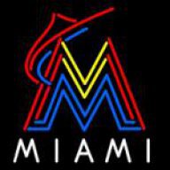
June 12, 20188 yr They'll go with something completely new. They aren't trying to bring back the old unis Something new but influenced by the uniforms they wore this past weekend is my prediction along with being essentially 100% different than the current look because the current look represents the Loria era that they're trying to distance themselves from. Also by doing something new they'll get people to always call the new uniforms something like "the Jeter Marlins uniforms." With this combination they're rebranding themselves as a new era while simultaneously separating themselves from Loria and pleasing the heavy desire to look more like the classic Marlins look. It's a perfect combo and I'd be shocked if this isn't the route they take. While I'm here, looking back on the Miami rebrand in 2012, I completely understand why Loria made something totally different from what came before. Even if not everyone agreed with it, it made sense at the time to rebrand especially when you consider that Loria expected this team to be a championship team from day one. Did it work? Not at all. But that doesn't mean it wasn't something worth trying.
June 12, 20188 yr Well, 25th anniversary weekend came and went. I will miss these teal jerseys. But damn man, I want teal jerseys back forever. Go look at Social Media. Read this article. People want their teal. So do I. Who agrees? ? if you agree. If you don’t, I respect your opinion, but you’re wrong. And don’t tell me the current color scheme has “flavor”. Even though it sort of does. Thank you! https://www.google.com/amp/www.sun-sentinel.com/news/sound-off-south-florida/fl-sp-marlins-teal-uniforms-follow-20180607-story,amp.html the current flavor is "puke".... Bring back teal!!!!! I'm in!!!
June 12, 20188 yr I'd like something new that represents the spirit of the old unis but I wouldn't mind the old teal uni being an alternate either
June 12, 20188 yr Something I thought of this weekend that would be a great alternate for a rebrand because it would feel fresh and new even though its not exactly new... contrary to popular belief they've never worn a teal alternate jersey in a regular season game. The classic all teal jerseys of the past were all spring training/batting practice jerseys. A teal alternate jersey would be an awesome inclusion in a rebrand.
June 12, 20188 yr Also, can we please finally have a primary home jersey that reads "Marlins" instead of "Miami" again? That's one of the major flaws (it's a long list) with the 2012-2018 design. I'm trusting that the new FO has some people with a better aesthetic eye than Loria had (ironic because he was an art dealer). Somebody in charge must have some semblance of taste because they reduced the size of the comically oversized cap logo and are clearly doing all they can to phase out orange as a primary color.
June 12, 20188 yr Teal wordmark and pinstripes are an absolute must in my eyes. I think that's the most unique and "fun" feature of the classic Marlins uniform while still being traditional. It's using a unique and untraditional color in a traditional way.

Join the conversation
You can post now and register later. If you have an account, sign in now to post with your account.
Note: Your post will require moderator approval before it will be visible.