November 19, 20196 yr so far Dback uni tweak is a huge improvement, Padres set isn't a bad move but i think it needs some tweaking, Brewers is the best set so far, They went back to one of the most unique and creative logo in baseball. So who has the most boring set for 2020 ? Rays ?
November 19, 20196 yr Both home jerseys are good but I find it weird to have the pinstripes be the alternate but that's totally just nitpicking. I'd have made the cream one the alternate, like a Sunday jersey. The new ball in glove is a slight downgrade only because they connected the m with the b. Separate it again and it would be ten times better. The navy jersey is kinda ugly and unnecessary except for the beautiful script wordmark. The random head spoon piping doesn't relate to the other uniforms, the whole jersey looks like it came from a different team uniform set, like a random Milwaukee college team. The gray is fine but dull, it would be immensely better if it used the Milwaukee script from the navy jersey like the 93 road uniforms. Do that and drop the navy jersey and the whole set is massively improved. But very good look all around. This will be a hit in Milwaukee.
November 19, 20196 yr Oh my God the logo is navy and the hat is navy! How ever will we see it on TV?!!!! serious though all the uniform changes this winter have been good. In my opinion the teams that need to go make some adjustments Twins - the gold ruins an otherwise great set of designs Rangers -they need to clean up their font. It looked good in 94 when it debuted but the changes they made to it since then make it too busy. Just go back to the original 94 mark and they’ll be good. Reds - get rid of the black and the gimmicky font Marlins - I think we’ve covered this
November 19, 20196 yr In my opinion the teams that need to go make some adjustments Twins - the gold ruins an otherwise great set of designs Rangers -they need to clean up their font. It looked good in 94 when it debuted but the changes they made to it since then make it too busy. Just go back to the original 94 mark and they’ll be good. Reds - get rid of the black and the gimmicky font Marlins - I think we’ve covered this Agreed on all of those, but I would add that I'd love to see the Phillies go back to burgundy. It was unique to them, like brown to the Padres. There's enough red in baseball and they looked good in burgundy...they should own it.
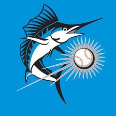
November 19, 20196 yr So with the worst uniforms in MLB, Arizona, finally removing what made their uniforms so bad and with the two teams with major identity crisises finally pointing in the right direction this immensely upgrades MLB uniforms across the board. Correcting these three worst offenders is a great step forward. The "worst" uniforms now aren't so bad.
November 20, 20196 yr instead of a reg baseball inside the MB glove logo, if they insert the baseball with wheat would have been much better, removing the blue background of course
November 20, 20196 yr The new ball in glove is a slight downgrade only because they connected the m with the b. Separate it again and it would be ten times better. That's exactly what I was thinking! Have you been reading my diary? That's a very @rmc523 thing to do.
November 20, 20196 yr That's exactly what I was thinking! Have you been reading my diary? That's a very @rmc523 thing to do. I mean, it is a fascinating read....
November 22, 20196 yr Love seeing teams revisit their actual roots and ditching the gimmicky stuff they all went to in the 90s. As someone said, would love to see the Phillies do the same. Would not mind seeing the following: Mariners going back to the early 80s look at least as an alternative. Angels maybe going back to an older font on their jerseys, to me their uniforms are fucking boring. Marlins honestly may be the dumbest logo in all of MLB, though the Orioles would be better off going back to the old 70s logo style, instead of what they have now.

Join the conversation
You can post now and register later. If you have an account, sign in now to post with your account.
Note: Your post will require moderator approval before it will be visible.