PhxPhin Posted November 12, 2011 Share Posted November 12, 2011 Only 60% awful is surprising ..... although they had 3 levels of like and only one option for dislike and it is strongly worded Quote Link to comment Share on other sites More sharing options...
Jonny Ramos Posted November 12, 2011 Share Posted November 12, 2011 http://www.orlandose...48523,post.poll Orlando Sentinel newspaper poll Interesting poll results. Are you really surprised? Quote Link to comment Share on other sites More sharing options...
Jonny Ramos Posted November 12, 2011 Share Posted November 12, 2011 Only 60% awful is surprising ..... although they had 3 levels of like and only one option for dislike and it is strongly worded Not surprising at all. We have become somewhat accustomed to the logo already seeing as it was leaked more than a month ago. At the end of the day as fans we succumb to the inevitability and 'accept' this logo. People that are seeing it for the first time will have that reaction (same reaction as 90% of the people in here had). Step back for a second, and forget about everything else, it is truly an awful logo. Quote Link to comment Share on other sites More sharing options...
MarlinKidd101 Posted November 12, 2011 Share Posted November 12, 2011 Only 60% awful is surprising ..... although they had 3 levels of like and only one option for dislike and it is strongly worded Not surprising at all. We have become somewhat accustomed to the logo already seeing as it was leaked more than a month ago. At the end of the day as fans we succumb to the inevitability and 'accept' this logo. People that are seeing it for the first time will have that reaction (same reaction as 90% of the people in here had). Step back for a second, and forget about everything else, it is truly an awful logo. No Quote Link to comment Share on other sites More sharing options...
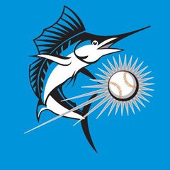
TheChickenRuns@Midnight Posted November 12, 2011 Share Posted November 12, 2011 What is the easiest way to upload a photo here? I have something nice for you guys I just made. Quote Link to comment Share on other sites More sharing options...
I Love Me Some Fish Posted November 12, 2011 Share Posted November 12, 2011 What is the easiest way to upload a photo here? I have something nice for you guys I just made. photobucket, imgur etc.Upload them there and copy and paste from there to here. Quote Link to comment Share on other sites More sharing options...
MarlinKidd101 Posted November 12, 2011 Share Posted November 12, 2011 What is the easiest way to upload a photo here? I have something nice for you guys I just made. Naughtay Quote Link to comment Share on other sites More sharing options...
MarlinKidd101 Posted November 12, 2011 Share Posted November 12, 2011 Nice Quote Link to comment Share on other sites More sharing options...
Jonny Ramos Posted November 12, 2011 Share Posted November 12, 2011 Only 60% awful is surprising ..... although they had 3 levels of like and only one option for dislike and it is strongly worded Not surprising at all. We have become somewhat accustomed to the logo already seeing as it was leaked more than a month ago. At the end of the day as fans we succumb to the inevitability and 'accept' this logo. People that are seeing it for the first time will have that reaction (same reaction as 90% of the people in here had). Step back for a second, and forget about everything else, it is truly an awful logo. No No? because if I remember correctly, this wasn't well received here either. So yes. Look it's obviously not as bad as we make it out to be, and it's one of those things that the more you look at it the more you start to get used to. I agree with you guys when you say this would be a non-issue opening day. Uniforms look decent as well. Can't say the same for the hat though, that one is going to take a very long time to get used to for me. Quote Link to comment Share on other sites More sharing options...
Hollyberry Posted November 12, 2011 Author Share Posted November 12, 2011 :o Fiesta Fish Quote Link to comment Share on other sites More sharing options...
SkyJuice Posted November 12, 2011 Share Posted November 12, 2011 yes albert... it suits you! Quote Link to comment Share on other sites More sharing options...
Jonny Ramos Posted November 12, 2011 Share Posted November 12, 2011 yes albert... it suits you! Agreed. I would not say 1 more negative comment about the uni/logo if this were the case. Quote Link to comment Share on other sites More sharing options...
MarlinKidd101 Posted November 12, 2011 Share Posted November 12, 2011 Only 60% awful is surprising ..... although they had 3 levels of like and only one option for dislike and it is strongly worded Not surprising at all. We have become somewhat accustomed to the logo already seeing as it was leaked more than a month ago. At the end of the day as fans we succumb to the inevitability and 'accept' this logo. People that are seeing it for the first time will have that reaction (same reaction as 90% of the people in here had). Step back for a second, and forget about everything else, it is truly an awful logo. No No? because if I remember correctly, this wasn't well received here either. So yes. Look it's obviously not as bad as we make it out to be, and it's one of those things that the more you look at it the more you start to get used to. I agree with you guys when you say this would be a non-issue opening day. Uniforms look decent as well. Can't say the same for the hat though, that one is going to take a very long time to get used to for me. No. Just...no. Quote Link to comment Share on other sites More sharing options...
Jonny Ramos Posted November 12, 2011 Share Posted November 12, 2011 Only 60% awful is surprising ..... although they had 3 levels of like and only one option for dislike and it is strongly worded Not surprising at all. We have become somewhat accustomed to the logo already seeing as it was leaked more than a month ago. At the end of the day as fans we succumb to the inevitability and 'accept' this logo. People that are seeing it for the first time will have that reaction (same reaction as 90% of the people in here had). Step back for a second, and forget about everything else, it is truly an awful logo. No No? because if I remember correctly, this wasn't well received here either. So yes. Look it's obviously not as bad as we make it out to be, and it's one of those things that the more you look at it the more you start to get used to. I agree with you guys when you say this would be a non-issue opening day. Uniforms look decent as well. Can't say the same for the hat though, that one is going to take a very long time to get used to for me. No. Just...no. Yes. Quote Link to comment Share on other sites More sharing options...
TheChickenRuns@Midnight Posted November 12, 2011 Share Posted November 12, 2011 Im buying my Stanton jersey today. Even if the uniform was a picture of sesame street characters I'll still wear it. Stop complaining and support your team. Im tired of seeing people wear NY jerseys. Quote Link to comment Share on other sites More sharing options...
I Love Me Some Fish Posted November 12, 2011 Share Posted November 12, 2011 The unis are being worn by our Arizona Fall League team. Quote Link to comment Share on other sites More sharing options...
Wild Card Posted November 12, 2011 Share Posted November 12, 2011 The unis are being worn by our Arizona Fall League team. Yea, I remember Samson saying something a few weeks ago like, "When we change, EVERYTHING changes. Even the players in the AFL will get their new Uni's THE NEXT DAY." Crazy to see how they implemented that so quickly. Quote Link to comment Share on other sites More sharing options...
Jorge Regula Posted November 12, 2011 Share Posted November 12, 2011 i cant wait to get one of the orange hats. but im not sure if i want it because its awesome or hideous. Quote Link to comment Share on other sites More sharing options...
Admin Posted November 12, 2011 Share Posted November 12, 2011 Anyone know where I can get a replica of the black alternate jersey? I only saw the BP version and the Authentic black one so far. Quote Link to comment Share on other sites More sharing options...
Wild Card Posted November 12, 2011 Share Posted November 12, 2011 i cant wait to get one of the orange hats. but im not sure if i want it because its awesome or hideous. At the stadium last night I hated it at first but it grew on me more and more, because the yellow isn't obvious on the orange hat like it is on the black. Also, the Orange jersey with "Marlins" on the front is definitely my favorite. I hope they get off this MIAMI obsession soon and wear those uni's, because they look SOOO much better. Quote Link to comment Share on other sites More sharing options...
all black marlins hat Posted November 12, 2011 Share Posted November 12, 2011 Do you think little league teams across south florida that call themselves the "marlins" will change logo's too? lol just a thought.... Quote Link to comment Share on other sites More sharing options...
BosnianBaller_ Posted November 12, 2011 Share Posted November 12, 2011 the orange caps kinda look cool. but the yellow in the M is just unnecessary, doesn't really need to be there. Quote Link to comment Share on other sites More sharing options...
DcFishFan Posted November 12, 2011 Share Posted November 12, 2011 saw the unis in person at marlins en miami store this morning. first off, they had basically nothing in the store. no white unis at all, no xl in any jerseys but the orange. the stuff looks even worse in person. at the very least, the orange caps should be used for hunters or construction workers folks buying the hats (i passed: all they had was the 36 dollar on-field caps with the enormous logos) did so only out of allegiance to the team, not because they were particularly enamored with the logo. i give this current logo three years max. Quote Link to comment Share on other sites More sharing options...
Admin Posted November 13, 2011 Share Posted November 13, 2011 I'm pretty sure that logo on the hat can be seen from space. What were they thinking? Quote Link to comment Share on other sites More sharing options...
Pensacolabluewahoos Posted November 13, 2011 Share Posted November 13, 2011 New to the forum , long time marlins fan. I kind of like the logo and I really like the unis what I don't get use to is the colors on the M . Maybe too many colors, but as a true marlins fan inwill root for them no matter what. Go fish Quote Link to comment Share on other sites More sharing options...


Recommended Posts
Join the conversation
You can post now and register later. If you have an account, sign in now to post with your account.
Note: Your post will require moderator approval before it will be visible.