September 22, 201115 yr Yeah, but if it's not teal and black, it's gay. Duh! "I was the first man who wanted to go to war!"
September 22, 201115 yr To quote the legendary miamibaseball, "We bad news bear." More like "Bad logo bear."
September 22, 201115 yr A simulated version of Bartolo Colon taking the mound in the new Marlins Ballpark I suppose?
September 22, 201115 yr A simulated version of Bartolo Colon taking the mound in the new Marlins Ballpark I suppose? this is actually an image from the future (don't ask... I know a guy.) Sabathia vs Prince in the World Series
September 22, 201115 yr Seeing as they're so set on changing everything, and combined with the backlash on the supposed logo and colors, would you think the FO would prohibit anyone from wearing teal and/or previous jerseys?
September 22, 201115 yr Yes, that is an M. We have one in our logo now too. Wee! Cool. There's also 10 million ways to design the letter M, and we happen to choose one that resembles a childrens video game.
September 22, 201115 yr For arguments sake that doesn't resemble the Mario M.There's a significant dip in the middle of the Marlin M that's quite the opposite in Mario.
September 22, 201115 yr Just for the record, a rainbow would look like this: Three colors a rainbow does not make. ... Believe it or not, I'd actually accept this. Hah! Agtee, lol
September 22, 201115 yr Seeing as they're so set on changing everything, and combined with the backlash on the supposed logo and colors, would you think the FO would prohibit anyone from wearing teal and/or previous jerseys? Uhhhhhhhhhhhhhhhhhhh
September 22, 201115 yr Cool. There's also 10 million ways to design the letter M, and we happen to choose one that resembles a childrens video game. Uhhhhhhhhh It's a totally different font and the Mario one is monochrome. Like, cool, you hate the logo. You can hate the logo and not be totally ridiculous.
September 22, 201115 yr Seems like he's just making a joke. There's no reason to be so uptight about it.
September 22, 201115 yr Cool. There's also 10 million ways to design the letter M, and we happen to choose one that resembles a childrens video game. Uhhhhhhhhh It's a totally different font and the Mario one is monochrome. Like, cool, you hate the logo. You can hate the logo and not be totally ridiculous. Oh, shut up. I'm poking fun at a logo by comparing it to Mario. You're defending it as if you designed the logo yourself.
September 22, 201115 yr The logo sucks. Im ending my life. Squall! There are things to live for! Think of the children!
September 22, 201115 yr I kind of like the shape of the M, the Marlin is kind of.... corporate... for baseball. Baseball is a bird on a bat or a giant racist indian head and an old-timey font. There are some great art-deco colors and fonts that this team could use this is kind of my thinking too.
September 22, 201115 yr But wait... how does this change Billy? What does this mean for Billy? I'm surprised this hasn't brought up yet, does Billy change colors to this crap?
September 22, 201115 yr But wait... how does this change Billy? What does this mean for Billy? I'm surprised this hasn't brought up yet, does Billy change colors to this crap? I'm just guessing obviously but I figure he'll be the same body but just have the new jersey and the new cap on.
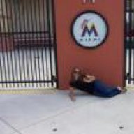
September 22, 201115 yr LOL.... http://i56.tinypic.com/315di0j.jpg[/img] http-~~-//www.youtube.com/watch?v=zuognicaN04





Join the conversation
You can post now and register later. If you have an account, sign in now to post with your account.
Note: Your post will require moderator approval before it will be visible.