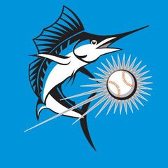
legacyofCangelosi Posted February 10, 2019 Share Posted February 10, 2019 Im commenting late on this, but the Braves Mr Met look alike mascot is named Homer. He debuted in 1989. I don’t know if you guys remember the previous mascot, who would be seen as extremely racist by today’s standards. He was a Native American guy that would come out of a teepee. Quote Link to comment Share on other sites More sharing options...
Admin Posted February 10, 2019 Share Posted February 10, 2019 People are saying old billy scared kids. I don’t see how. Any kid scared by that billy would also be scared by this billy IMO. I’ve heard of kids being scared at Chuck E. Cheese and those are kid friendly mascots too. Some kids just get scared of mascots. Quote Link to comment Share on other sites More sharing options...
Piazza31 Posted February 10, 2019 Share Posted February 10, 2019 "Scared of the old Billy" is just people grasping at straws. This new Billy would be ok if the eyes weren't so "Anime" looking, I THINK thats the thing that's throwing me off. Him slimming down alot too kinda kills the "joyfulness" of a fat guy, and takes some of Billy's schtick away too. The "Nosejob" though, I can understand wanting to fix that. The way they had this mascot rolling around, and acting- reminded me of Minnie Mouse at Disney. Quote Link to comment Share on other sites More sharing options...
Admin Posted February 10, 2019 Share Posted February 10, 2019 This kinda resembles Little Billy both in appearance and personality, that idea they had for a year or two. Quote Link to comment Share on other sites More sharing options...
SilverBullet Posted February 10, 2019 Author Share Posted February 10, 2019 Someone on Instagram commented that he looks like a Tiny Toon and that seems to fit. Tiny Toons was a 90s cartoon where the Looney Tunes characters were done as kid versions, they had bigger eyes, rounder faces/chubby cheeks, and an overall "cuter" look though for Billy that's a step backwards. [ATTACH]2707._xfImport[/ATTACH] Quote Link to comment Share on other sites More sharing options...
SilverBullet Posted February 10, 2019 Author Share Posted February 10, 2019 There are only two major problems with him... the eyes are bigger and the eyebrows are more pronounced and it's a creepy look... second big problem to me is that the bottom of the head cuts off in almost a perfect horizontal line. Compare the old head where the bottom tapered and rounded down into the jersey like if he had a neck. This new head is like he has a big bucket on his head. It's bad. Minor problems, the fatter chubby mouth is odd, the cleats aren't horrible but how is that better than the fins that he had considering he is a fish? The hat logo omg shoot me. Why is it different than the real caps? There is no excuse for that plus that fake logo sucks. I don't have a problem with him being thinner because he's still "fat"... I was more afraid he would be one of those mascots with a big head and an almost normal adult sized body below it, which would make him look like a human with a fish mask, kinda like the body shape that Mr Met has. Lastly I think it's a downgrade but I can live with the nose job. Overall he is clearly being changed to be more for kids but I dont think a mascot has to look like a kid to be for kids. The best mascots in sports can take pictures with some adults and it still looks fine. Not this Billy though. Now that I think about it he was probably just changed to be different than the pre Jeter days. It's a mandate to change everything even Billy so that nobody confuses this ownership tenure with any before it. I'm telling you they probably changed all the door knobs in the offices just because Loria's hands touched them. Quote Link to comment Share on other sites More sharing options...
rmc523 Posted February 10, 2019 Share Posted February 10, 2019 22 hours ago, el_gmac said: [MEDIA=twitter]1094303148435537920[/MEDIA] I agree with all of this. The hat logo is INEXPLICABLE. Like WTF? Why on earth would you have a completely different logo to everything else? I guess I could understand if it were the patch directly. But it doesn't match any patch, any logo, any anything. I remember them saying they wanted to change the nose because they were worried about the other one poking people, so while I liked the old one, I'm ok with that part of it. The rest just seems like they changed things to change things like you said. --- It seems like they went more toward this cartoony version of Billy. [ATTACH]2711._xfImport[/ATTACH]/monthly_2019_02/image.png.be30011b917f46408e25ce8774e32c48.png" data-ratio="123.89"> [ATTACH]2710._xfImport[/ATTACH] [ATTACH]2710._xfImport[/ATTACH] Quote Link to comment Share on other sites More sharing options...
rmc523 Posted February 10, 2019 Share Posted February 10, 2019 The only reason I can come up with for the hat logo is for the kids? So they know he's a baseball mascot? To reinforce the baseball part of it? Quote Link to comment Share on other sites More sharing options...
Admin Posted February 10, 2019 Share Posted February 10, 2019 The only reason I can come up with for the hat logo is for the kids? So they know he's a baseball mascot? To reinforce the baseball part of it? Nah it was an error by the company that made it but they won't re-do it and Jeter is too cheap to have it done again. Quote Link to comment Share on other sites More sharing options...
SilverBullet Posted February 10, 2019 Author Share Posted February 10, 2019 The only reason I can come up with for the hat logo is for the kids? So they know he's a baseball mascot? To reinforce the baseball part of it? Seems like a stretch. Kids aren't that stupid lol. Nobody saw the old Billy and had confusion about who he represented. Quote Link to comment Share on other sites More sharing options...
el_gmac Posted February 10, 2019 Share Posted February 10, 2019 "Scared of the old Billy" is just people grasping at straws. This new Billy would be ok if the eyes weren't so "Anime" looking, I THINK thats the thing that's throwing me off. Him slimming down alot too kinda kills the "joyfulness" of a fat guy, and takes some of Billy's schtick away too. The "Nosejob" though, I can understand wanting to fix that. The way they had this mascot rolling around, and acting- reminded me of Minnie Mouse at Disney. this is what happens when you watch too much dragon ball z Quote Link to comment Share on other sites More sharing options...
rmc523 Posted February 10, 2019 Share Posted February 10, 2019 Seems like a stretch. Kids aren't that stupid lol. Nobody saw the old Billy and had confusion about who he represented. Hey, I know I'm grasping at straws here, just trying to come up with something that makes some remote amount of sense. Quote Link to comment Share on other sites More sharing options...
Das Texan Posted February 10, 2019 Share Posted February 10, 2019 I'm telling you they probably changed all the door knobs in the offices just because Loria's hands touched them. I would do the same. Fuck that POS Loria. Quote Link to comment Share on other sites More sharing options...
SilverBullet Posted March 7, 2019 Author Share Posted March 7, 2019 Is it just me or does he not look as bad in these pics? Definitely still think he was downgraded but he looks more like the old Billy here than that creepy thing at FanFest... [MEDIA=twitter]1103477157156847616[/MEDIA] Quote Link to comment Share on other sites More sharing options...
Admin Posted March 7, 2019 Share Posted March 7, 2019 He looks fine from the side and from the back. The front pic though, not good. Quote Link to comment Share on other sites More sharing options...
SilverBullet Posted March 7, 2019 Author Share Posted March 7, 2019 He looks fine from the side and from the back. The front pic though, not good. Eyes too big, face too squished together... that's why the front view is bad. These pics make me notice that they weren't that far away from getting him right. (I still hate the shoes too... he's a fish, what was wrong with him having fins?) Quote Link to comment Share on other sites More sharing options...
Admin Posted March 7, 2019 Share Posted March 7, 2019 That promo is weird on another note. "Gas up for Opening Day" Who the hell can get gas today and still be using the same gas on Opening Day? Quote Link to comment Share on other sites More sharing options...
rmc523 Posted March 7, 2019 Share Posted March 7, 2019 I hate that hat. It looks horrible. Still don’t at all understand why it’s not the same as the cap either. Quote Link to comment Share on other sites More sharing options...
QbanCastillo Posted March 8, 2019 Share Posted March 8, 2019 (I still hate the shoes too... he's a fish, what was wrong with him having fins?) Perhaps they're still there, inside the shoes... or maybe he was just self-conscious, ok? Nothing wrong with a little extra work being done, after the nose job. He could have gotten a 2-for-1 special that day! Looking at that side-angle though I feel like the back head-fin looks a bit too big seeing as the nose was made smaller. The hat in the front picture reminds me of those British police bobby hats. Still hate the look the helmet creates on the neck-area. I feel sorry for the guy's adam's apple. Quote Link to comment Share on other sites More sharing options...
SilverBullet Posted March 8, 2019 Author Share Posted March 8, 2019 Still hate the look the helmet creates on the neck-area This is one of the biggest flaws. This should get more hate. The old Billy the head tapered down towards the jersey, this one is almost cut straight across horizontally. Quote Link to comment Share on other sites More sharing options...
AeroFishOne Posted March 8, 2019 Share Posted March 8, 2019 Might be old news, but Pop! vinyl figures is doing MLB mascots including Billy. Hate the things normally but I’m going to have to get Billy. Quote Link to comment Share on other sites More sharing options...
rmc523 Posted March 8, 2019 Share Posted March 8, 2019 This is one of the biggest flaws. This should get more hate. The old Billy the head tapered down towards the jersey, this one is almost cut straight across horizontally. Agreed, I hate that horizontal line too - makes it look more like what it is - a mask - than a "real" thing. Quote Link to comment Share on other sites More sharing options...
SilverBullet Posted May 6, 2019 Author Share Posted May 6, 2019 I can't get over how bad Billy looks now. I seem to find more wrong with him each time I see him. Check out his legs here, looks like they just gave him blue sweatpants. It really looks like someone put together a homemade Billy costume, very much a cheap looking downgrade in quality... [ATTACH]2949._xfImport[/ATTACH] Quote Link to comment Share on other sites More sharing options...
Admin Posted May 6, 2019 Share Posted May 6, 2019 cheap Nailed it Quote Link to comment Share on other sites More sharing options...
Piazza31 Posted May 6, 2019 Share Posted May 6, 2019 I can't get over how bad Billy looks now. I seem to find more wrong with him each time I see him. Check out his legs here, looks like they just gave him blue sweatpants. It really looks like someone put together a homemade Billy costume, very much a cheap looking downgrade in quality... [ATTACH]2949[/ATTACH] I can see his RIBS!!! Denbo's taking this fat shaming thing to an Extreme! Quote Link to comment Share on other sites More sharing options...


Recommended Posts
Join the conversation
You can post now and register later. If you have an account, sign in now to post with your account.
Note: Your post will require moderator approval before it will be visible.