September 17, 201511 yr Please tell me this is Admin doing secret market research for the front office. Yes that should become a real jersey and should be worn in actual games. Preferably with the red orange caps. Not sure how many people realize that the Marlins' shade of blue is different than every other blue in baseball. It's a beautiful color that could definitely be spotlighted more.
September 17, 201511 yr You know for a team that really loves its money, you think the more shit we wear and advertise on the field, the more they sell. Looking at you orange hats.
September 17, 201511 yr i still prefer this [ATTACH]487._xfImport[/ATTACH] [ATTACH]488._xfImport[/ATTACH]
September 17, 201511 yr Please tell me this is Admin doing secret market research for the front office. Yes that should become a real jersey and should be worn in actual games. Preferably with the red orange caps. Not sure how many people realize that the Marlins' shade of blue is different than every other blue in baseball. It's a beautiful color that could definitely be spotlighted more. That sounds awful. Blue and orange? We're not Mets.
September 17, 201511 yr That sounds awful. Blue and orange? We're not Mets. The Marlins wore Orange n Blue before the Mets even existed. and yes they should wear the blue jersey but eliminate the orange or black jerseys, bring back the orange hats, and bring a blue crown/black brim alt hat to be wear with the blue jerseys
September 17, 201511 yr Author That sounds awful. Blue and orange? We're not Mets. how about this hat with it? http://mlb.imageg.net/graphics/product_images/pMLB2-12941769dt.jpg
September 17, 201511 yr Author I vote hell no. Fuck schizophrenic color schemes. Come up with a clear color identity and stick with it. Having black, red-orange, and blue alternate tops at once is dumb.
September 17, 201511 yr I personally looked at it and thought it was hideous. Baby blue doesn't scream professional baseball to me.
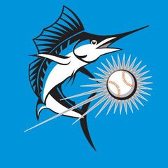
September 17, 201511 yr how about this hat with it? http://mlb.imageg.net/graphics/product_images/pMLB2-12941769dt.jpg yes. yes yes yes. if they're gonna keep these new dumb logos and colors, change the predominant color to this sky blue
September 17, 201511 yr That sounds awful. Blue and orange? We're not Mets. it's a different blue and orange than the Mets. The Marlins have a unique color palette that should be emphasized more.
September 17, 201511 yr Author I personally looked at it and thought it was hideous. Baby blue doesn't scream professional baseball to me. Its not baby blue, its ocean blue. Its basically the color that Jose had on his glove the other day and Dee had on his arm last night. I guess they were being unprofessional.
September 17, 201511 yr Author I vote hell no. Fuck schizophrenic color schemes. Come up with a clear color identity and stick with it. Having black, red-orange, and blue alternate tops at once is dumb. The Miami Marlins have a lot of colors in their scheme so if any team should have multiple alternates, its them. There are other teams with multiple alternates that I don't see the need.
September 17, 201511 yr yes. yes yes yes. if they're gonna keep these new dumb logos and colors, change the predominant color to this sky blue YES!! That would be nice.
September 17, 201511 yr Author yes. yes yes yes. if they're gonna keep these new dumb logos and colors, change the predominant color to this sky blue Agreed.
September 17, 201511 yr For a team based on a sea dwelling fish located in a beach city, the amount of blue in the new uniforms was always underwhelming. There were two ways Loria could have gone with the new stuff when we changed. Go with sea colors or go with colors "of Miami". It's obvious which one they chose.
September 17, 201511 yr For a team based on a sea dwelling fish located in a beach city, the amount of blue in the new uniforms was always underwhelming. There were two ways Loria could have gone with the new stuff when we changed. Go with sea colors or go with colors "of Miami". It's obvious which one they chose. Considering we went with sea creature colors for 19 seasons I don't mind the attempt at going with a more Miami feeling especially when the name change from Florida to Miami was so prominent. Whether or not the choice of colors or the execution of the design was a success is another discussion entirely but the concept isn't a bad one. Also, in general, I do love the red-orange color so while I like the blue as an alternate I'm not sure I'd take it over the red-orange as the main color.

Join the conversation
You can post now and register later. If you have an account, sign in now to post with your account.
Note: Your post will require moderator approval before it will be visible.